Landing rebuild, part 3: The brief we threw out, and the rules that replaced it
By the Borker Team
Part 3 of eight on rebuilding our landing page. Part 2 is the decision that the page tells a story. The hub lists every part.
Starting it like a feature
I started the rebuild the way I would start a feature. A research pass first, with a researcher on each question.
Then three designers, each handed every sheet and told to produce a concept deliberately different from the others in how it shows the week. Then two critics scoring every concept on the same nine criteria, and an editor merging it all into one brief.
It came back as pages of text and tables. The research was good. The brief was too much to rule on.
The three concepts
Each concept came with three things.
| Deliverable | What it holds |
|---|---|
| Section ledger | For every section: its purpose, the problem it answers, the mechanism, the evidence, the build cost |
| Outline | The page at both widths |
| Artboards | Three per concept |
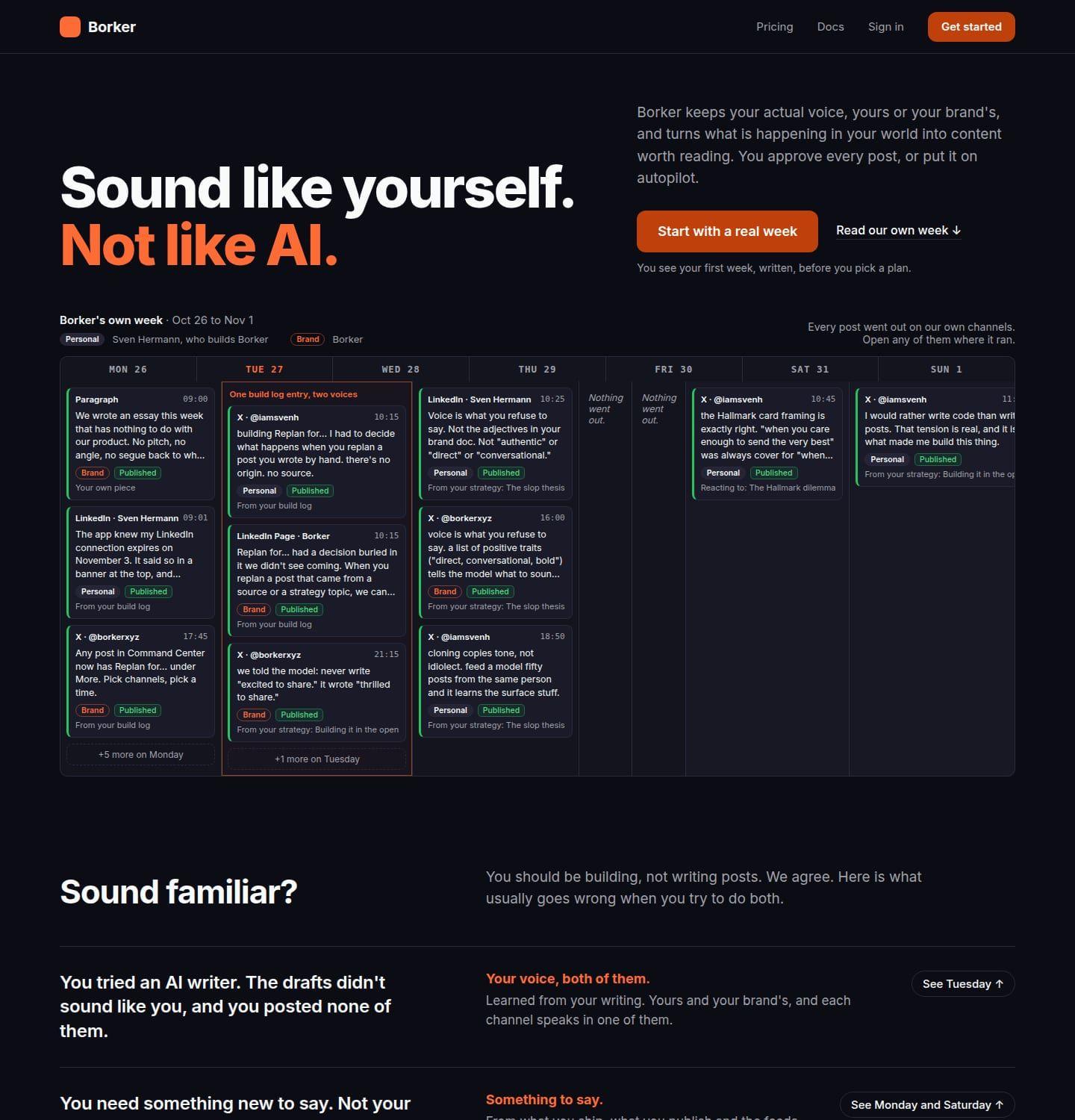
Concept A: The week
You have been burned by AI drafts and will not believe a headline. The first screen shows a real week from our own channels, drawn the way the app draws it, and the page proves every claim by pointing at a day in that week.
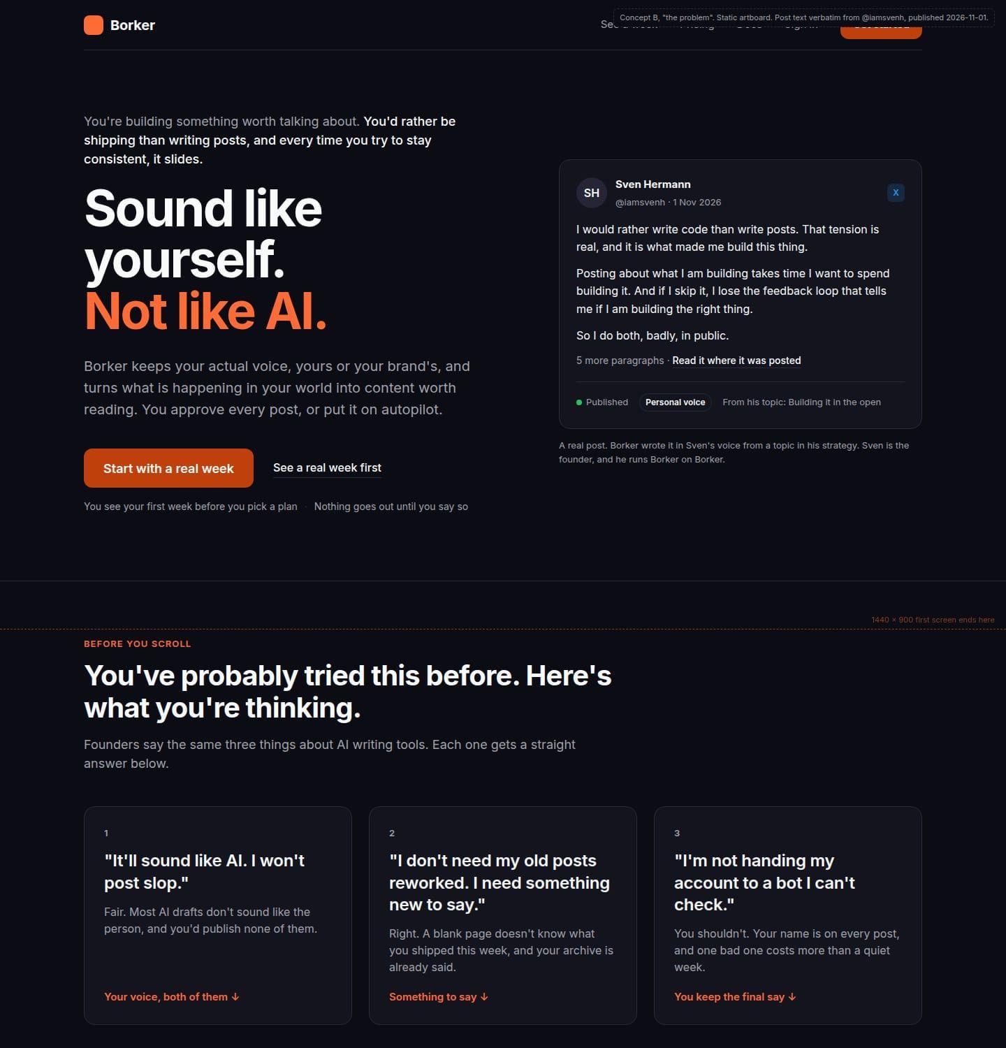
Concept B: The problem
You arrive doubting. The page opens on your situation and names your three objections out loud:
- It will sound like AI.
- It will rework what I already said.
- I will not hand my account to something I cannot check.
It answers each with one of the three claims and a real post, and only then shows the week as the payoff.
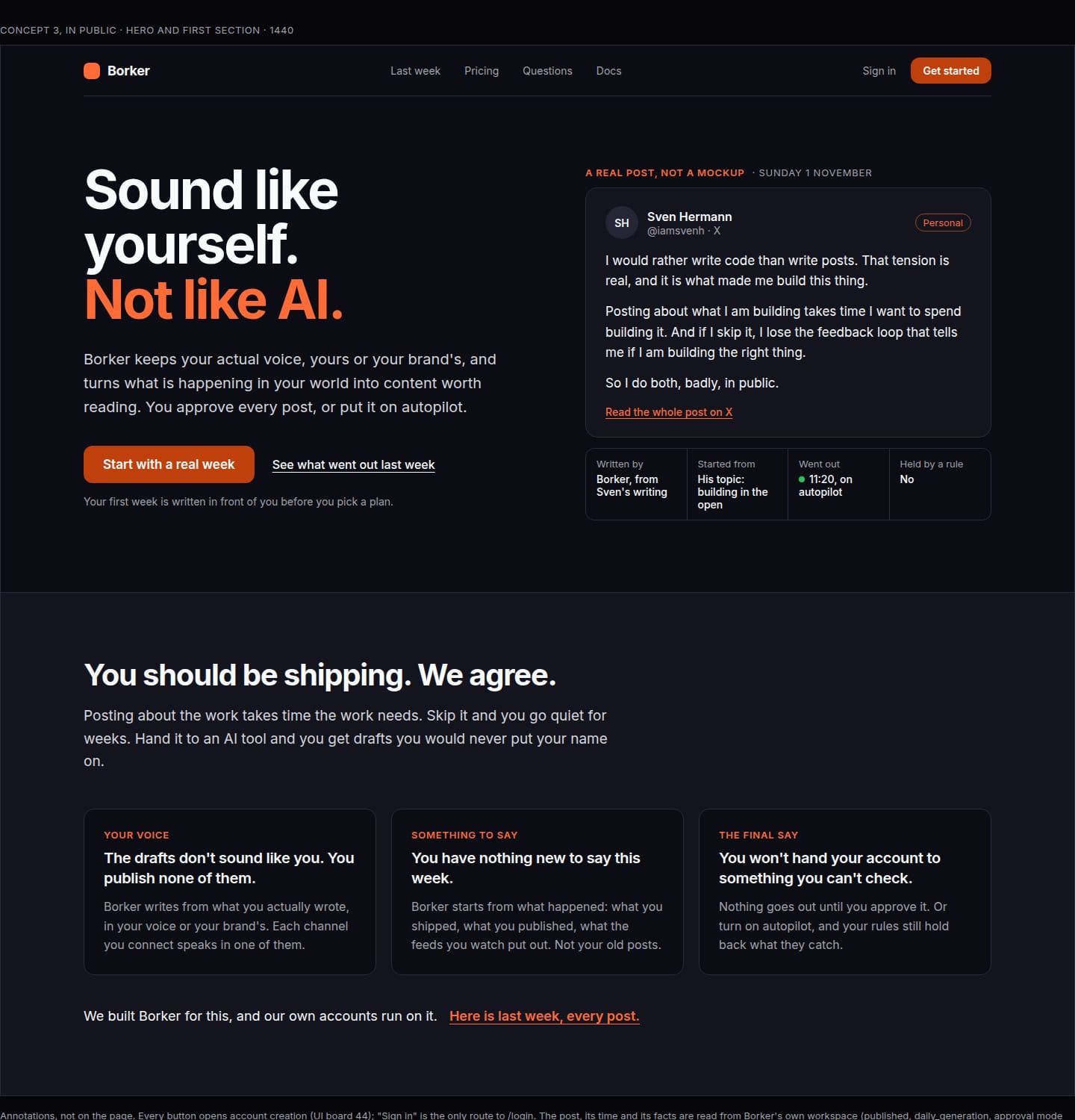
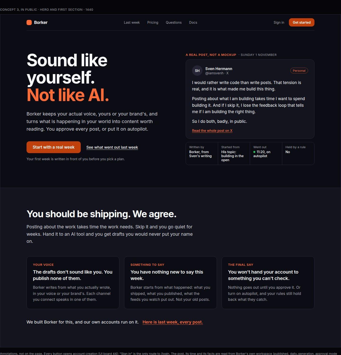
Concept C: In public
You have seen a hundred mockups of a perfect week. This page shows ours: every post that went out from our own accounts last week, none left out, each with its time and its voice, where it came from and whether a rule held it, and a link to the live post.
The scores
The two critics scored on their own and picked the same one.
| Criterion | A, The week | B, The problem | C, In public |
|---|---|---|---|
| Founder-centric | 3 | 5 | 4 |
| Every element purposeful | 4 | 3 | 5 |
| Claim-safe | 3 | 2 | 4 |
| Honest proof | 4 | 3 | 5 |
| Mechanism pushed down to the docs | 4 | 3 | 4 |
| Mobile first | 5 | 3 | 4 |
| Performance and accessibility | 4 | 4 | 5 |
| Buildable in one package | 4 | 3 | 2 |
| Distinct and memorable | 3 | 3 | 5 |
| Total of 45, first critic | 34 | 29 | 38 |
| Total of 45, second critic | 35 | 33 | 38 |
Why I threw it out
I read the brief on a laptop and could not rule on it. A visitor deciding whether to sign up would get even less from a page built on it. My verdict, in the words I used at the time: a decent starting point, emphasis on starting point.
The specific failures:
- Too much text everywhere. Every concept was paragraphs. A visitor on a phone gets a wall.
- Too static. Three pages of cards and tables. Nothing moved, nothing carried you.
- Too founder-specific. All three pages were written for a startup founder. The people who have something to say and a social presence to keep alive are builders, artists, travellers, inventors, consultants. Founders are one of them.
- Real data and names where there must be none. The concepts read our own workspace live and put real posts, real handles and my name on the page. A page that shows whatever went out last week shows next week's bad post too, before anyone has looked at it.
Concept C was the closest. Everything else was replaced.
What survived: the research
The research sheets are still the inputs for everything that came after. The mechanisms sheet in particular settled questions we would otherwise have argued about for a week, with a verdict and a reason per mechanism. A few rows:
| Mechanism | Verdict | Reason in one sentence |
|---|---|---|
| Static headline, the hook | use | Short and plain, and plain copy converts best in the largest benchmark we found |
| Product screenshot in the hero | avoid | Shows the tool rather than the result, goes stale with the UI, unreadable on a phone |
| Real posts rendered as live text | use | Our output is text, and real text is the fastest, most accessible and most honest proof we can show |
| Live generation demo in the hero | avoid | A cold generation cannot know the visitor's voice and would fail the hook in the first screen |
| A scripted demo presented as live | avoid | Breaks the nothing-invented rule |
| Autoplaying video hero | avoid | Heavy, distracting, a pause-control duty, and text is a poor subject for video |
| AI voiceover | avoid | A synthetic voice under the headline "Not like AI" argues against the page |
| Animation libraries | avoid | Weight for effects CSS already does |
| Logo strip, traction numbers, live signup popups | avoid | We have none we may show, the brand rules forbid the numbers, and the popups are pressure |
| Third-party post embeds | avoid | Heavy scripts, cookies and layout shift; render our own cards |
| Pricing on the landing | use | Buyers ask for a public price, and the category hides it |
| Performance budget as an acceptance criterion | use | Speed lifted sales in every case study we could open |
| Every call to action opens account creation | use | The sign-in page leak outweighs any hero choice |
The rules I wrote instead
Instead of a brief, a short list of rules, each one a reaction to a failure above.
- Visual. The picture carries the meaning. A headline of six words or fewer and one line per beat. No paragraphs. A frame that needs a paragraph is wrong.
- A story you scroll. One take, not ten cards. Scroll-driven transitions between beats, dynamic, alive. Every beat complete at rest, as a still. Reduced motion gets crossfades. The page works without the motion.
- For any professional with a social presence. Not founders only.
- No real data, no live read, no customer or founder name anywhere. Designed content only.
- No graphics drawn or generated by agents in the final product. The reason is in part 5.
- In stages, each a page I can scroll. Storyboard, then style, then the asset kit and the motion spec, then one act built for real, then the build. Nothing is built before the stage before felt right. A checkpoint is an artifact I scroll with a few sentences beside it, never a document.
The hard question stayed open: how do you show what Borker does without a demo of the product? The product's surfaces are not the point, and a screenshot of them is the product shot the research told us to avoid. The answer came from an unexpected place, and that is part 4.
The series: hub · part 1 · part 2 · part 3 · part 4 · part 5 · part 6 · part 7 · part 8
New here? Borker is the AI content engine for founders.
We learn your voice, read your sources, plan your week and write each post before it goes out, while you build the actual product.