Borker on your phone
Every page that mattered on desktop now works on your phone. Approve drafts on the train. Catch a 7 AM hot take from bed and have it queued before your coffee's done. The Pipeline, Command Center, Settings, and admin tooling all made the jump. The marketing landing got a refresh in the same release.
You can now run Borker from your phone. The whole authenticated product, every settings page, the Pipeline, the Command Center, the admin panel. The marketing landing got a refresh in the same release.
Borker on your phone
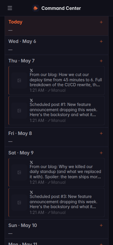
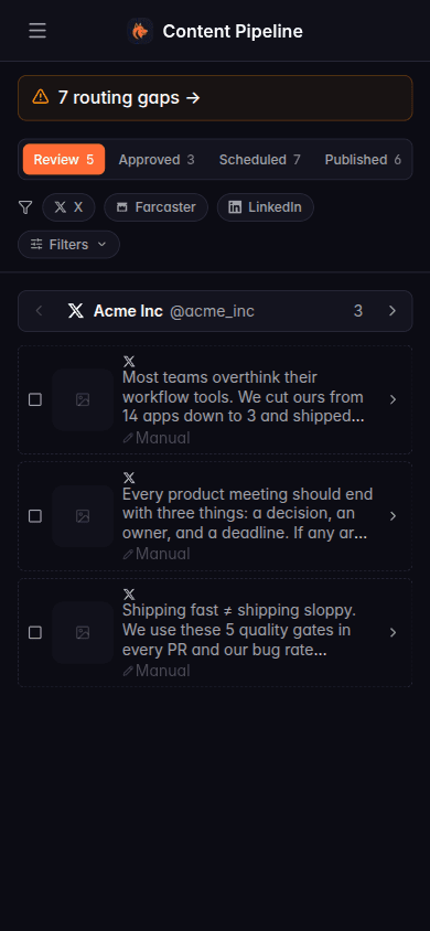
The Pipeline used to assume you had a 1280-pixel-wide window open. Bulk-action toolbars overlapped the channel filter pills, dropdowns clipped off the right edge of the viewport, the routing matrix was unreadable at anything narrower than a tablet. If you wanted to approve a draft on your phone you had to either get to a laptop or zoom-pan-zoom your way through a desktop layout that wasn't built for thumbs.
That's gone. Every page that matters has been rebuilt mobile-first.
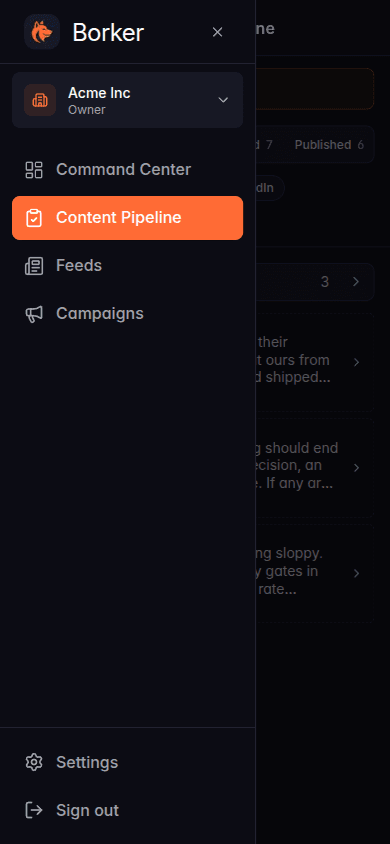
The Pipeline cards stack into a single column. Segmented tabs (Review, Approved, Scheduled, Published) span the row. Channel filters wrap onto a second row instead of clipping. The bulk-action bar slides up from the bottom of the screen as a sticky sheet when you select cards, so the buttons are exactly where your thumb is. Pull up the sidebar with the hamburger; it slides in as a drawer, the backdrop dims the page, tap outside to close.
Settings pages got the most invasive rework. Account-type and tier dropdowns used to jam into the same row as the channel name and the refresh icon, all overflowing. Now each channel row stacks onto its own card. The schedule page's "add slot" form, which used to chop the Cancel button off the right edge, now reflows onto multiple lines. The routing coverage matrix renders as a vertical list with the same colored badges and Fill buttons that desktop has.
Action buttons across the app got bumped to a 44-point minimum tap target on mobile (iOS Human Interface Guidelines minimum), so the routing rule power, edit, and delete icons are no longer impossible to hit accurately on a phone.
What else shipped
Pipeline and Command Center
The two screens you spend the most time in. Same data, same workflows, redesigned for one column. Selecting cards still triggers the bulk-action bar; on mobile it now slides up from the bottom as a sticky sheet instead of trying to fit inline.
Sidebar drawer
The desktop sidebar (workspace switcher, nav, settings link, sign out) collapses into a hamburger on mobile. Tap it, the drawer slides in. Tap outside, it closes. Standard phone-app behavior.
Settings reflow
Every settings page got rebuilt for mobile. Channels stack, the schedule slot form wraps, billing plan cards stop overlapping their action buttons, admin tables compress into card lists.
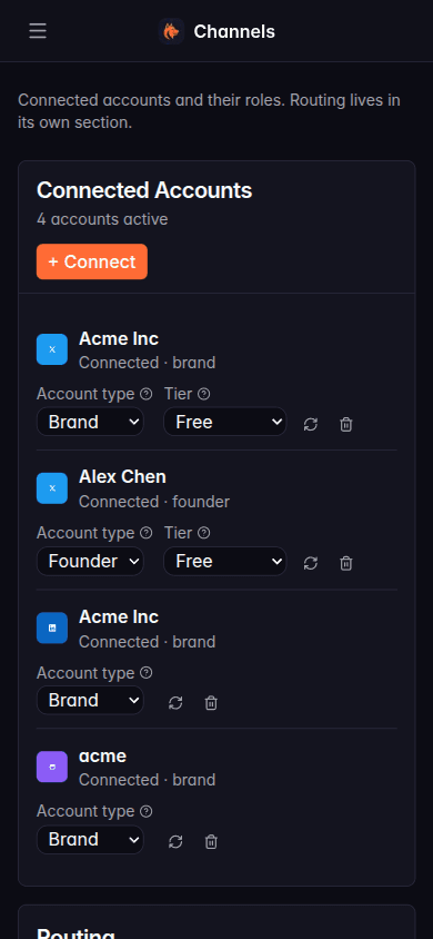
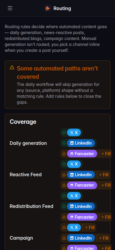
Routing coverage
The (source, platform) coverage matrix that warns you about uncovered automated paths is now readable on a phone. Same colored badges, same inline Fill button to add the missing rule.
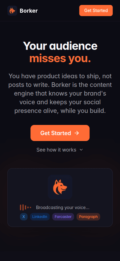
Refreshed landing page
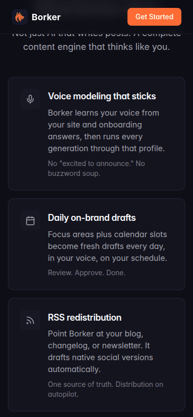
borker.xyz got a refresh. New section covering the seven things Borker does (voice modeling, daily drafts, RSS redistribution, news-reactive posts, multi-channel routing, AI-planned campaigns, the review pipeline). Onboarding animation rebuilt to match the actual one-form signup flow. A new sharable preview image so when someone drops a borker.xyz link in Slack or Telegram, the preview looks like a deliberate brand asset, not a screenshot.
The new "What Borker does" section walks through every capability:
New here? Borker is the AI content engine for founders.
We learn your voice, watch your news feeds, and ship posts to X, LinkedIn, Farcaster and your blog while you build the actual product.