Media kit
Logos, mascot, colors, type, layout rules, and ad templates. Everything affiliates and press need to make Borker look like Borker.
This page is the visual companion to the Messaging guide. The messaging guide is how to say it; this is how it should look when you do.
Affiliates use it to build social posts and ads. Press use it to source logos, founder bios, and product screenshots. Both download the same bundle.
Download
Grab everything, or grab the slice you need.
- Full kit — logos, mascot cutouts and scenes, product screenshots, ad starter packs, color/type tokens.
- Logos only — mark, wordmark, primary in light/dark/mono. SVG + PNG.
- Mascot cutouts — six poses, transparent PNGs. Drop into your own compositions.
- Mascot scenes — six full illustrations on light backgrounds. Drop in as hero images.
- Screenshots — clean product UI shots (
raw/) and pre-composed hero versions with title overlay (social/). - Ads — ready-to-post digital ads across four ratios and four headlines, plus a vertical magazine-ad series in four creator variants.
- Tokens — ASE swatches, Figma JSON, Tailwind config snippet.
What's in the bundle
| Folder | Contents | Format |
|---|---|---|
logos/ | Primary mark, wordmark, mark-only Shiba head. Orange, white, black, and orange-on-light card variants. | SVG + PNG |
mascot-cutouts/ | Six canonical Shiba poses on transparent backgrounds. Use these when you're composing your own design. | PNG (transparent) |
mascot-scenes/ | The same six poses as full illustrations on light backgrounds. Use these as drop-in hero images. | PNG (light bg) |
screenshots/ | Clean product screenshots in raw/ (bare UI for press articles) and social/ (pre-composed hero shots). | PNG |
ads/ | Digital ad starter pack in social/ (four ratios × four headlines) and a vertical print-ad series in print/ (four creator variants). | PNG |
tokens/ | Colors and type as an ASE swatch, Figma-ready JSON, and a Tailwind config snippet. | Mixed |
Identity
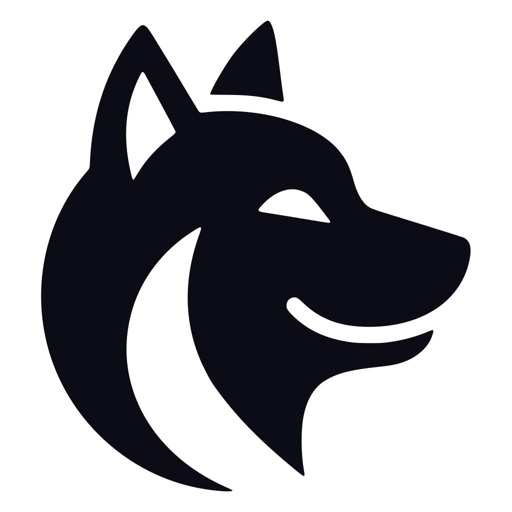
Logo
A smiling Shiba Inu silhouette in Borker Orange. Three forms, three colorways each.
Primary use (on light backgrounds):


On dark backgrounds (white):


Monochrome (for print, embossing, single-color contexts):
When to use which:
- Primary for headers, hero placements, the first time Borker appears in a piece.
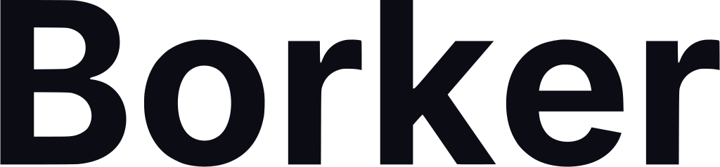
- Wordmark for places where the mark is too small to read, or when the mascot would steal focus.
- Mark only for app icons, favicons, tight squares, and avatars.
Formats: every variant ships as SVG (scales infinitely, ideal for print and large displays) plus PNG at 256, 1024, and 2048 px on the longer edge. See public/media-kit/logos/ for the full set.
Rules:
- Don't recolor the logo outside the brand palette.
- Don't add drop shadows, glows, or filters.
- Don't stretch or skew. The proportions are locked.
- Don't place the dark logo on the orange brand color or vice versa; contrast suffers.
- Minimum size: 32px tall for the mark, 80px wide for primary.
- Clear space: at least the height of the Shiba's ears on every side.
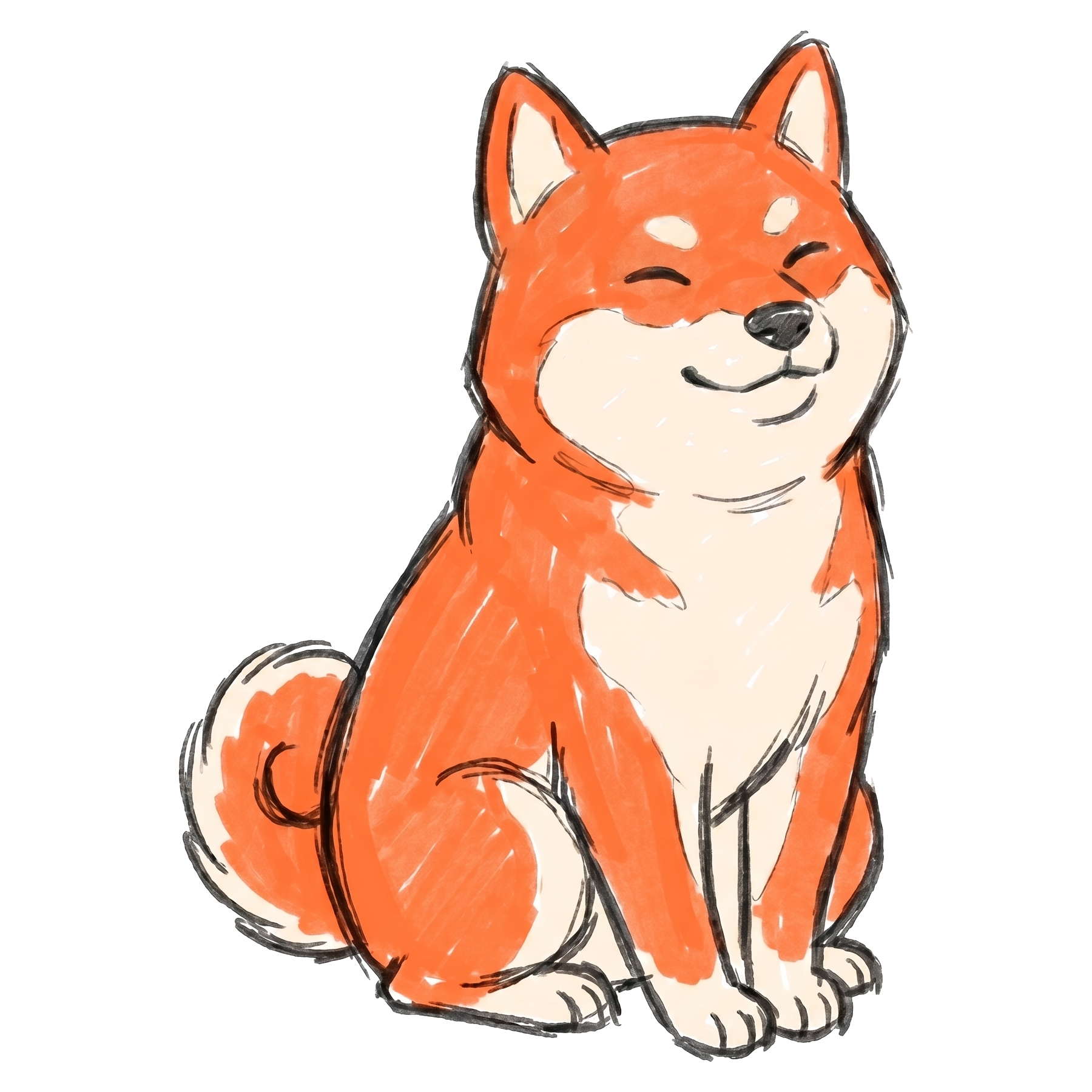
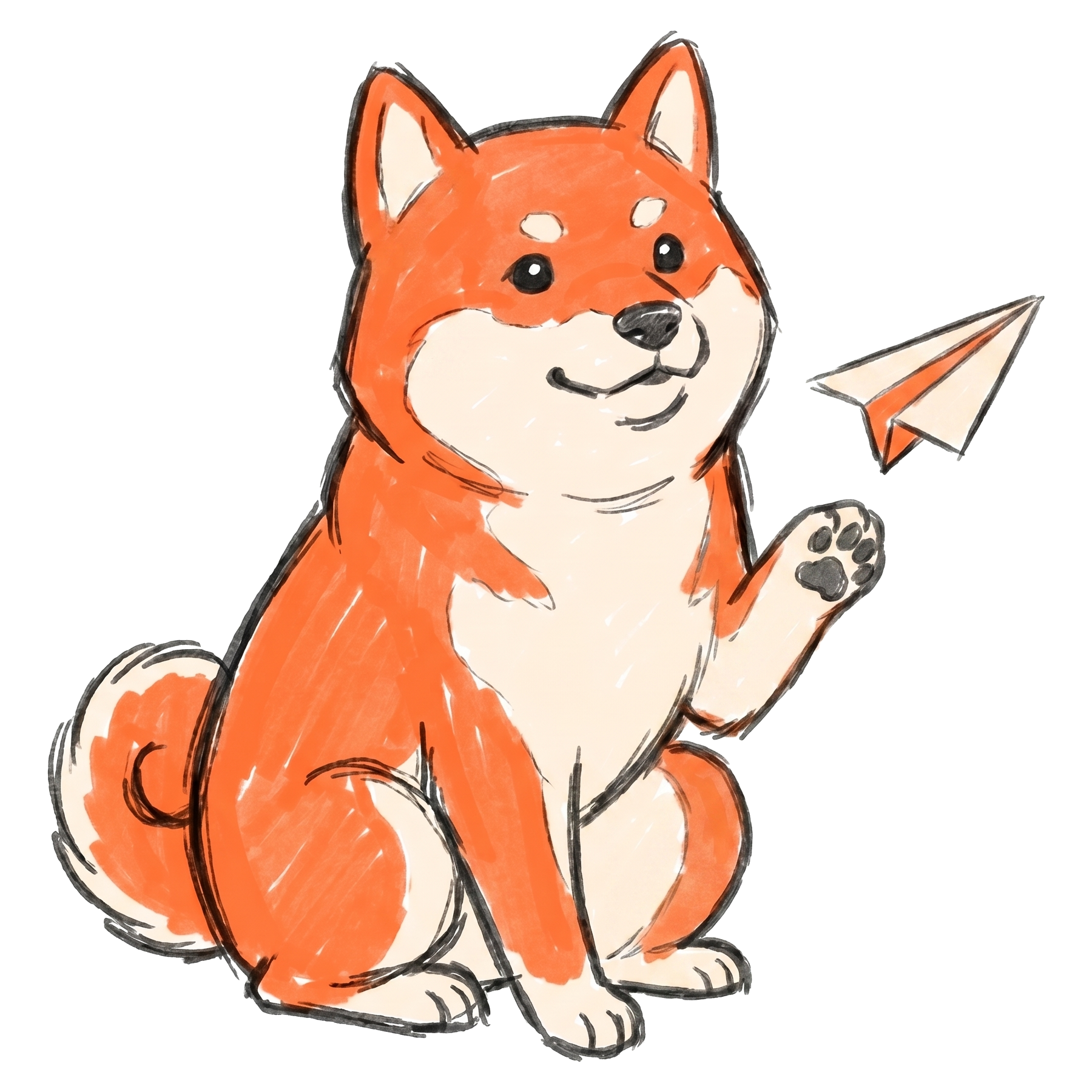
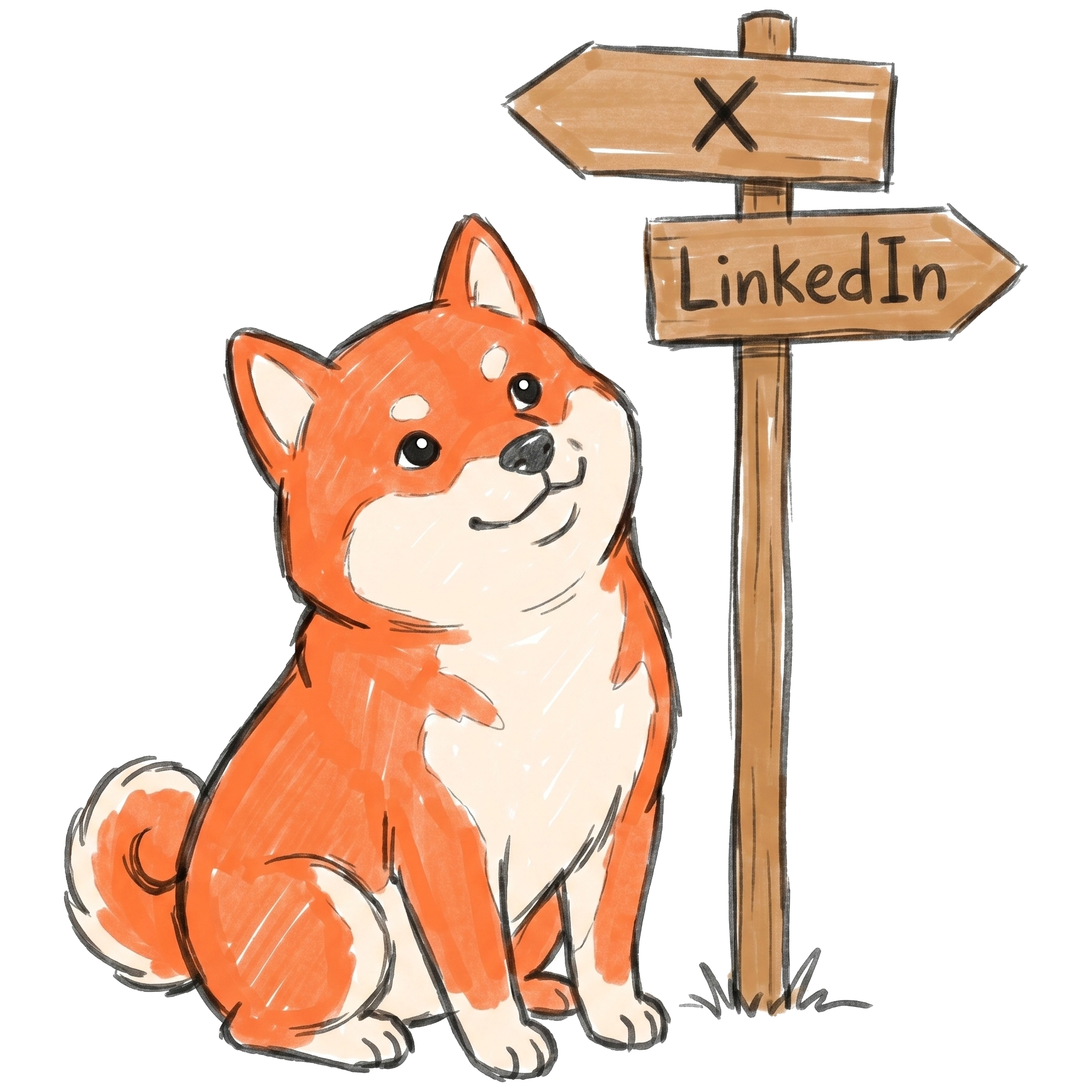
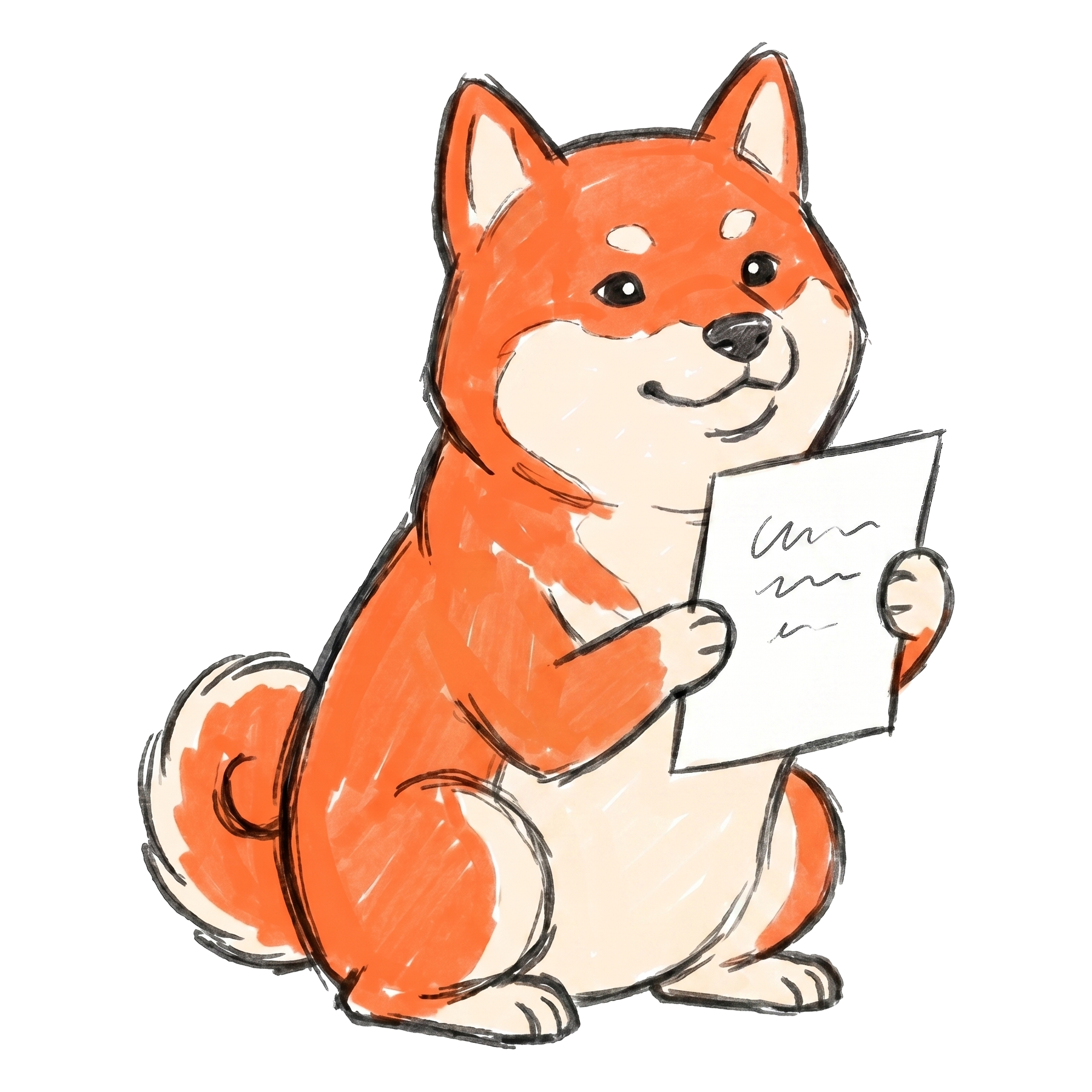
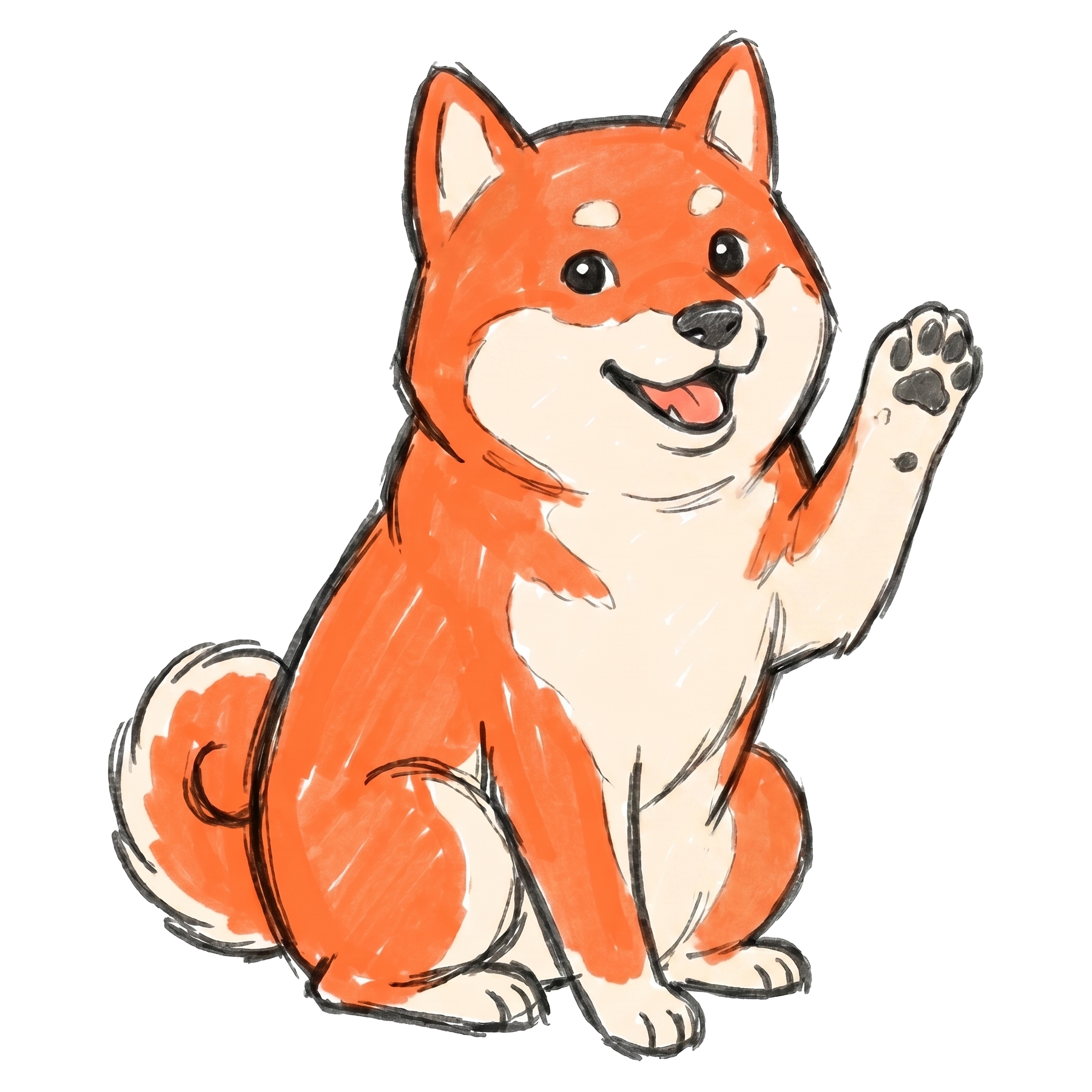
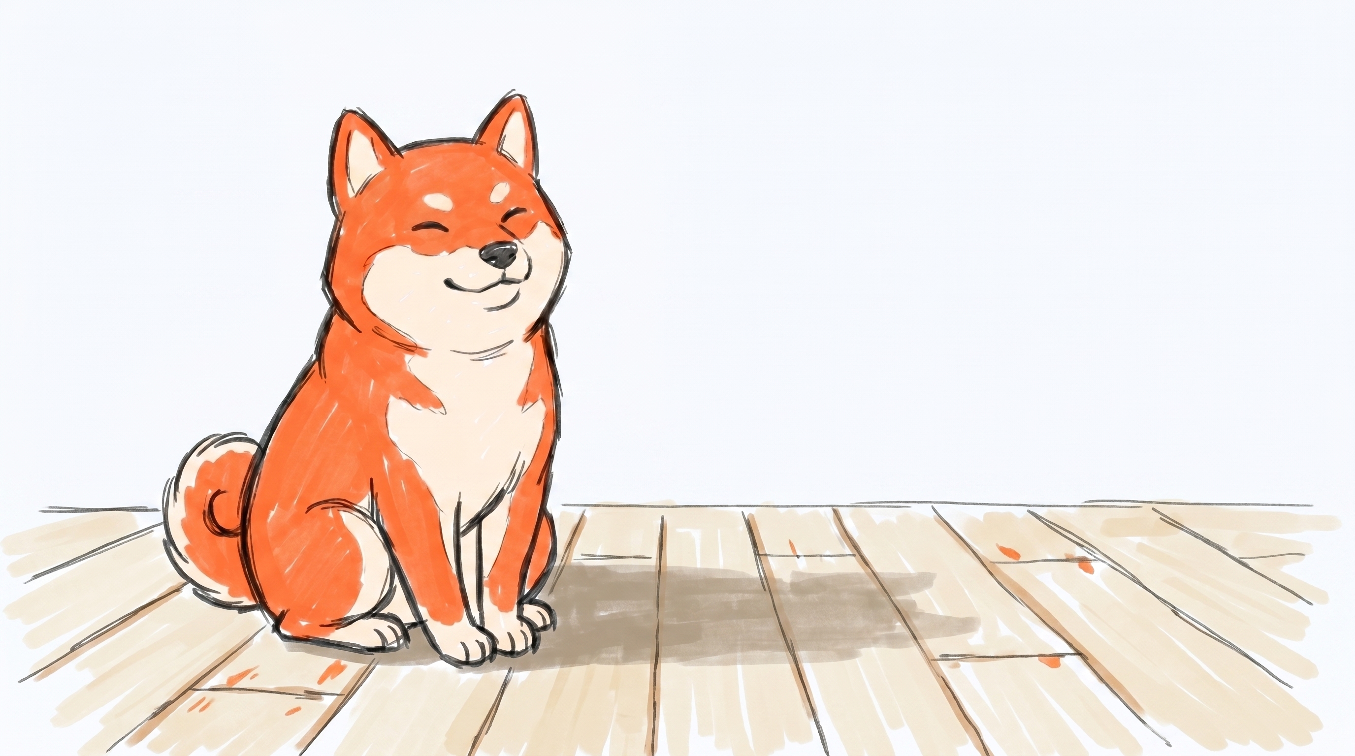
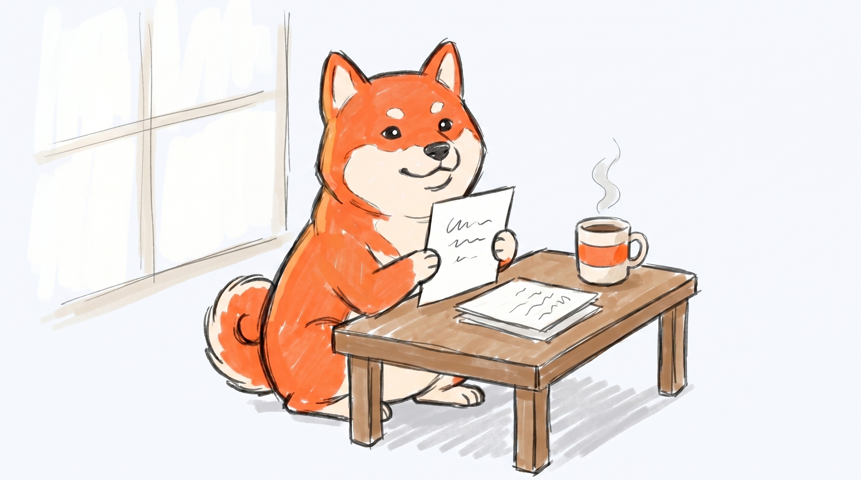
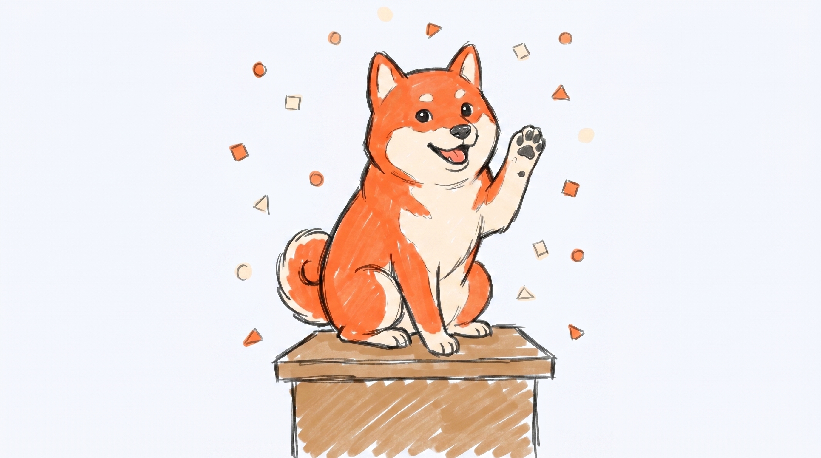
The Shiba mascot
The Shiba is Borker's recurring visual character. It carries more brand recognition than the wordmark does. Use it whenever you want a piece of content to feel like Borker, not just reference it.
Canonical look:
- Orange fur (
#ff6b35) with a cream/light underbelly. - Hand-drawn sketch line work. Slight roughness, not vector-clean.
- Friendly upright posture, sitting or in a small action pose. Never sprawled, never aggressive.
- Engaged with a prop (laptop, paper plane, signpost, draft) rather than just standing. The activity is the storytelling.
- Borker Orange used sparingly as the focal accent. Most of the scene is line art on a light background.
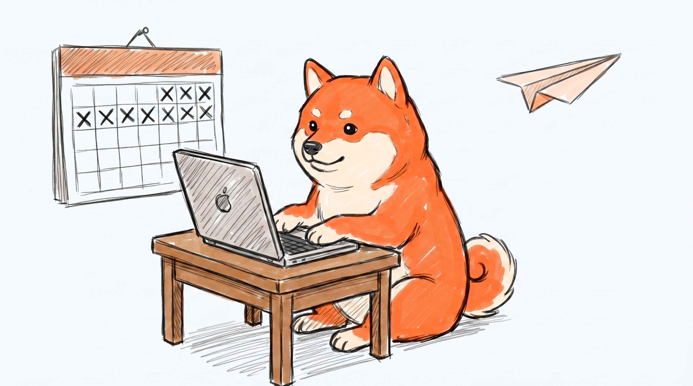
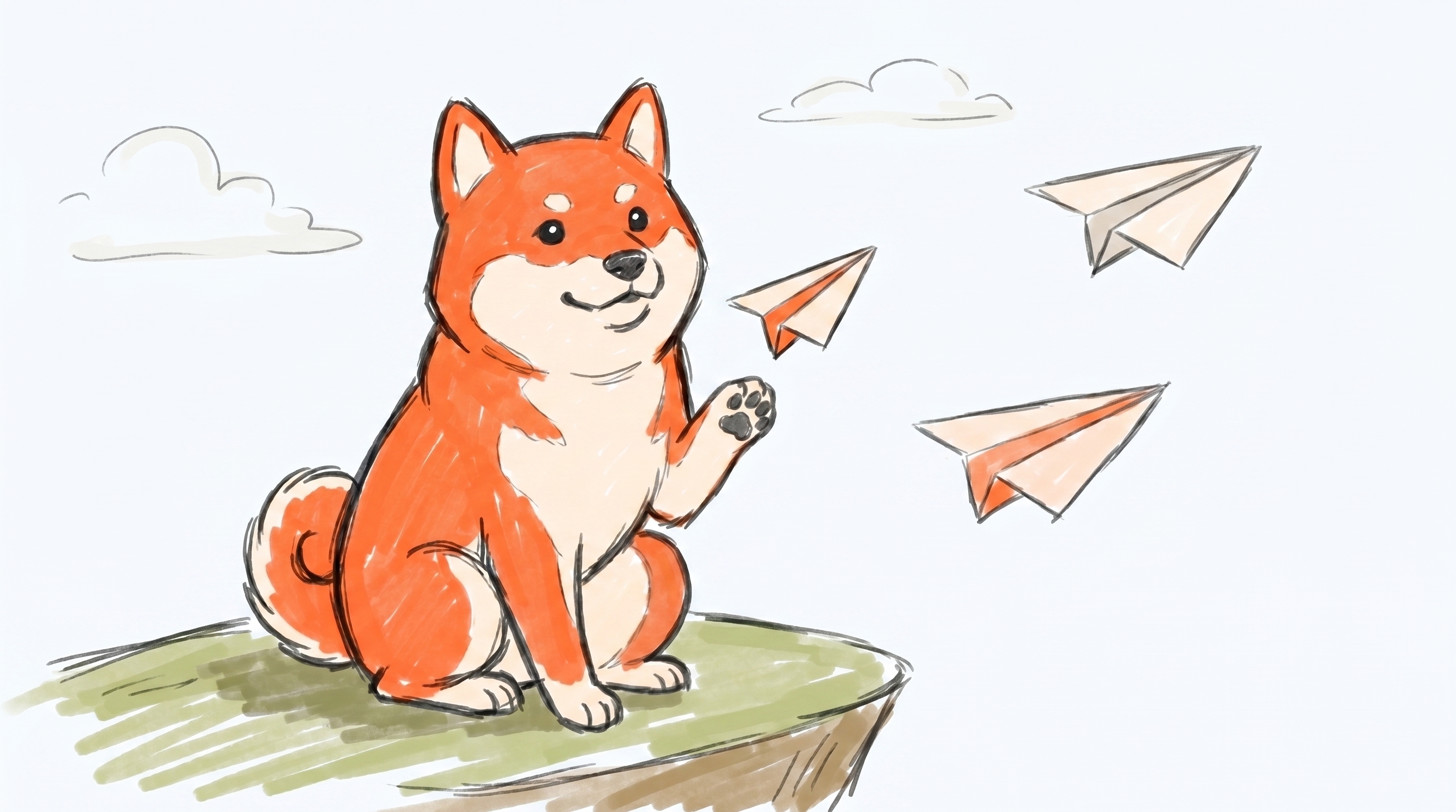
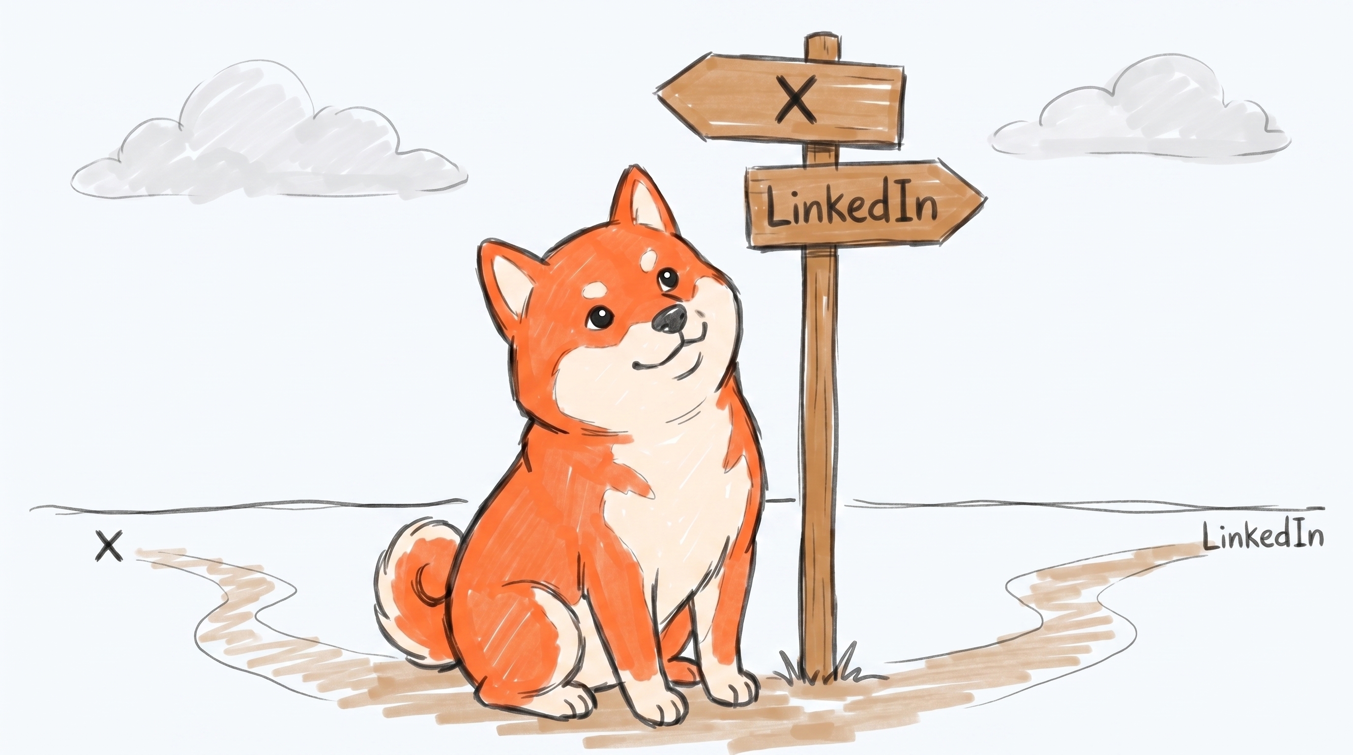
The six canonical poses shipped in the bundle:

| Pose | What it represents |
|---|---|
| Sitting (portrait) | Neutral / brand-anchor. The logo-adjacent pose. |
| At the laptop | Drafting, daily generation |
| Sending a paper plane | Publishing, "it shipped" |
| At a signpost | Routing, choosing a channel |
| Holding a draft | Approval pending, waiting on a human |
| Paw raised | Success, published, celebration |
If you need a pose that isn't in the set, ask. Don't generate a new Shiba. Getting the character consistent is hard, and an off-model mascot dilutes the brand for everyone using it.
Mascot scenes: the same six poses as full hero illustrations on a light background (#fafbfd), with environmental context. Drop straight into a landing page, social post, or article hero. 16:9, 2752×1536.
Color palette
| Role | Light mode | Dark mode |
|---|---|---|
| Brand | Borker Orange #ff6b35 (same in both modes) | |
| Background | #fafbfd | #0c0c14 |
| Surface | #ffffff | #14141f |
| Text | #0c0c14 | #f8fafc |
| Muted text | #5b5b6b | #a1a1aa |
| Border | #e2e3eb | #2a2a3c |
Borker Orange is premium. One or two accents per composition, 5-10% of the visible surface. If everything is orange, nothing is. Black/white line work and generous whitespace do the heavy lifting; orange points the eye.
Platform accents (only when you're showing more than one platform in a single visual):
- X
#1d9bf0, LinkedIn#0a66c2, Farcaster#8b5cf6, Paragraph#10b981.
Typography
Inter for everything. Two weights cover 95% of cases:
- Inter Bold: headlines and the punch word in a tagline.
- Inter Regular: body, captions, supporting copy.
Hand-lettered or sketchy text is fine inside hand-drawn illustrations as long as it stays legible.
Design tokens
If you're working in code or in Figma, grab the tokens bundle. It has the same values listed above in three formats so you don't have to retype them:
borker.ase— Adobe Swatch Exchange. Drag into Illustrator, Photoshop, or InDesign to load the eleven brand colors as a named swatch group.borker-tokens.json— Design Tokens Community Group format. Imports directly into Figma via the Tokens Studio plugin, and into Style Dictionary if you maintain your own token pipeline.borker-tailwind.config.js— drop thetheme.extendblock into yourtailwind.config.jsto getbg-borker-orange,text-display,font-borker, etc. as utility classes.
Two visual styles
| Style | Use for | Mood |
|---|---|---|
| Hand-drawn | Docs, explainer carousels, blog posts, screen recordings | Approachable, warm, conversational |
| Clean line | Marketing, landing pages, product UI, press materials | Polished, modern SaaS |
Pick one style per composition. Don't mix them. Hand-drawn next to clean-line in the same ad reads as "two unrelated brands."
Product screenshots
The bundle ships two kinds of product UI shots, both in light and dark theme variants. Press use the raw ones in articles. Affiliates use the social ones in posts.
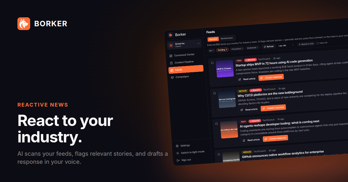
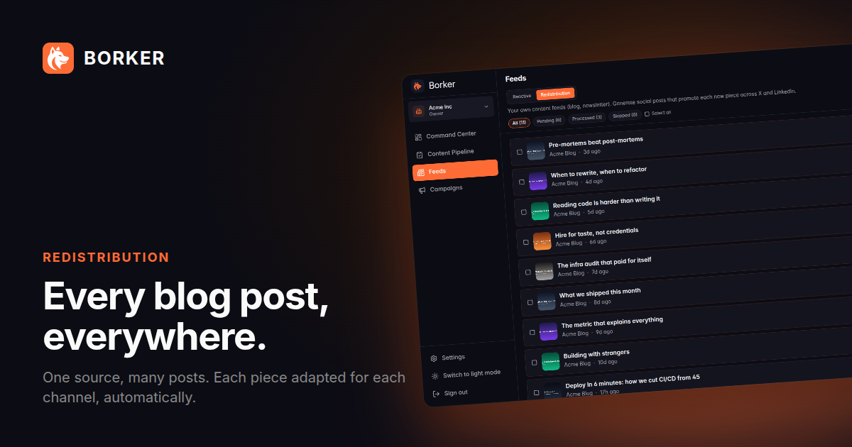
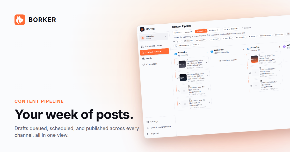
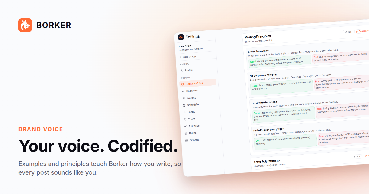
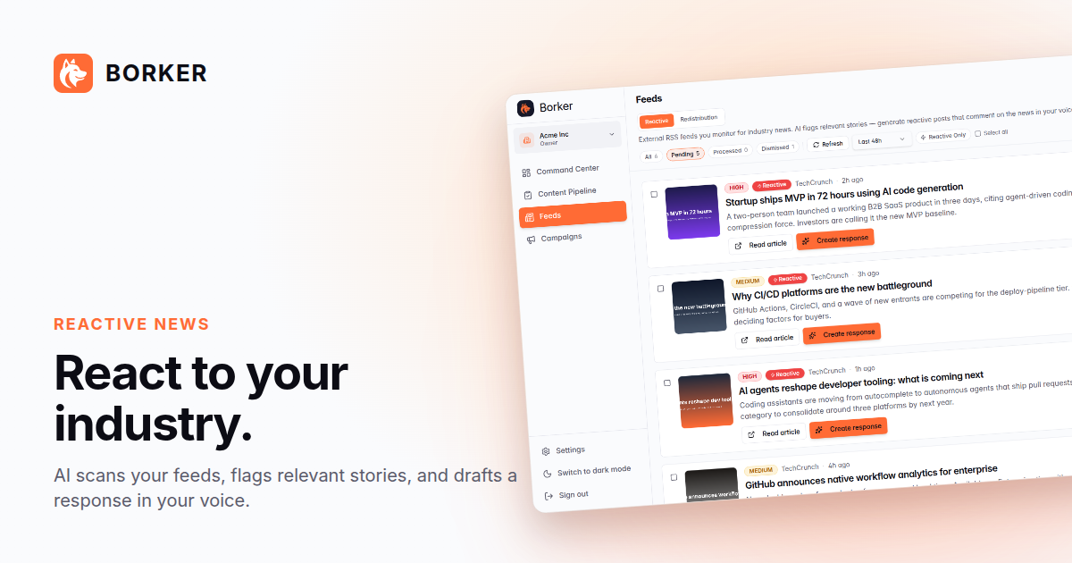
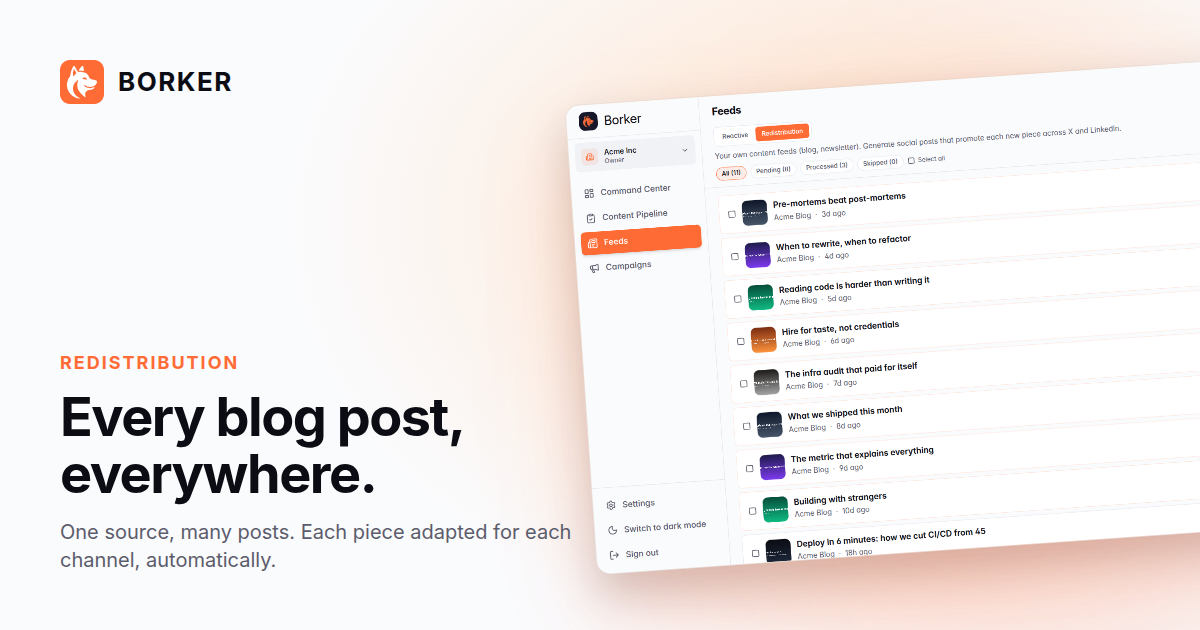
Raw (screenshots/raw/light/ and screenshots/raw/dark/) — the product UI, dev chrome stripped. Drop into a blog post, a press article, a tweet quote. They're 1440×900 PNG. Each theme has seven shots covering Pipeline, draft detail, schedule, brand voice (overview + writing principles), reactive news, and redistribution.
Social (screenshots/social/light/ and screenshots/social/dark/) — pre-composed 1200×630 hero versions wrapped in the OG card grammar: warm backplate, orange glow, BORKER mark, eyebrow label, headline, and tilted screenshot. Drop directly into a tweet, a LinkedIn carousel, a launch announcement. Each theme has four shots: Pipeline, brand voice, reactive news, redistribution.
Dark theme (default brand atmosphere):
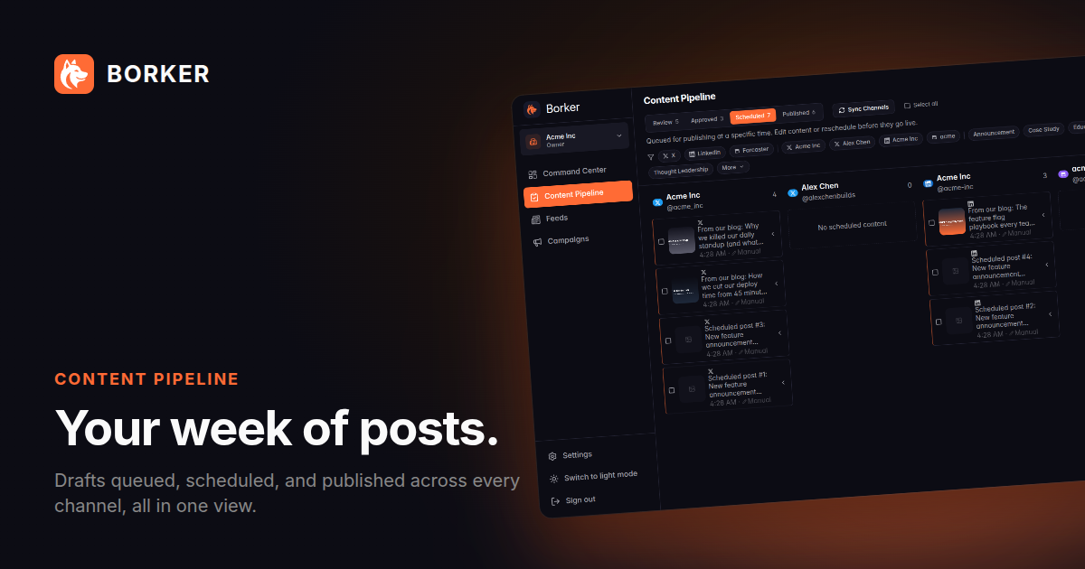
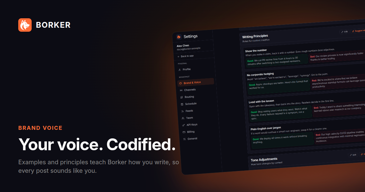
Light theme:
Rules:
- Don't crop the social shots. They're sized for 1200×630 (X / LinkedIn / OG card spec).
- Match theme to venue: dark for landing pages and dark-mode social, light for blog embeds and press articles.
- For your own composed posts, use the
raw/shots over a backplate you compose yourself.
Layout & composition
These rules work for both styles.
- Generous whitespace. The Shiba (or the focal concept) needs room to breathe. If it feels crowded, the reader's eye won't find the point.
- One focal point per image. Headline, mascot, or product screenshot. Not all three competing.
- Orange marks the focal point. Not the background, not the border. Just the thing you want the eye to land on.
- Light mode is the default for marketing. Dark mode is the product UI mode (and the OG card). Use light for ads, social posts, and landing-style content unless the venue forces dark.
- Never use: neon glows, hexagonal patterns, circuit boards, matrix / sci-fi tropes, generic AI-robot imagery, stock-photo founders pointing at laptops. They fight the founder-helper aesthetic.
Designing for ads
The bundle ships two ad grammars. Both are first-class. Pick whichever fits the venue: dark-and-digital for feed / OG / stories, light-and-editorial for print, longer-form newsletters, magazine takeovers, or anything you want to feel slower and more considered.
Three rules that hold across every ad format:
- One headline, one focal point, one CTA. If you can't summarize the ad in one sentence, it's two ads.
- Orange marks the focal point. A punch word, a stripe, a divider — pick one place per ad. Everything else is white or near-white (dark mode) or near-black (light mode).
- The Shiba shows up at least every other ad. It's the highest-recall element in the kit. Affiliates who use it convert measurably better than those who don't (anecdotal but consistent).
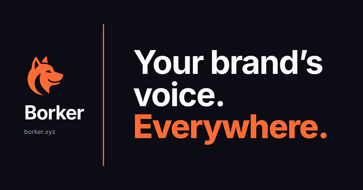
Grammar A — digital / social (dark)
The site's Open Graph card is the canonical example. Use this for feed posts, OG cards, and anywhere the venue is already a dark UI.
- Dark navy background (
#0c0c14) takes the whole canvas. - Logo + brand cluster anchored top-left (landscape) or top (square/portrait), 25-30% of the longer axis.
- Hard orange stripe divides the brand cluster from the tagline — vertical on landscape, horizontal on square/portrait.
- Tagline lives in the larger block. Inter Bold at 100px+, white for the first lines and Borker Orange for the punch word.
- "borker.xyz" sits small and muted under the wordmark or footer.
The bundle's ads/social/ folder has all four ratios × four headlines as PNGs. Use them as-is, or swap the headline by editing the source template at internal-docs/v2/MEDIA_KIT_SOCIAL_AD_TEMPLATE.html and re-rendering via bun run scripts/render-media-kit-social-ads.ts.
Aspect ratios and resolutions:
| Use case | Ratio | Resolution |
|---|---|---|
| OG card / X / LinkedIn single | 1.91:1 | 1200×630 |
| Instagram square | 1:1 | 1080×1080 |
| Stories / Reels / TikTok | 9:16 | 1080×1920 |
| Docs hero / blog header | 16:9 | 1920×1080 |
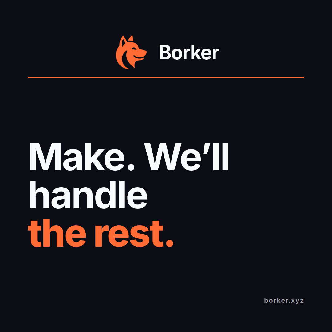
Grammar B — print / editorial (light)
Use this anywhere the ad sits inside long-form content — magazines, newsletters, partner blogs, full-page print. Slower-paced than the social grammar, scene-led instead of word-led.
- Cream background (
#fff5e8) takes the whole page. - Top 60% is a "radiating" mascot scene: the Shiba at a laptop with paper planes fanning out toward the platform names (X / LinkedIn / Paragraph / Farcaster / Blog). Tells the whole product story without a single word of copy.
- Middle 10% is the headline band. One line, large (~175px on letter portrait), no subhead. Optional orange side bars frame just this band for a magazine pull-quote feel.
- Bottom 30% is a minimalist line-drawing creator scene — easel for artist, desk for writer, drafting table for designer, workbench for maker. Quiet counterweight to the top scene.
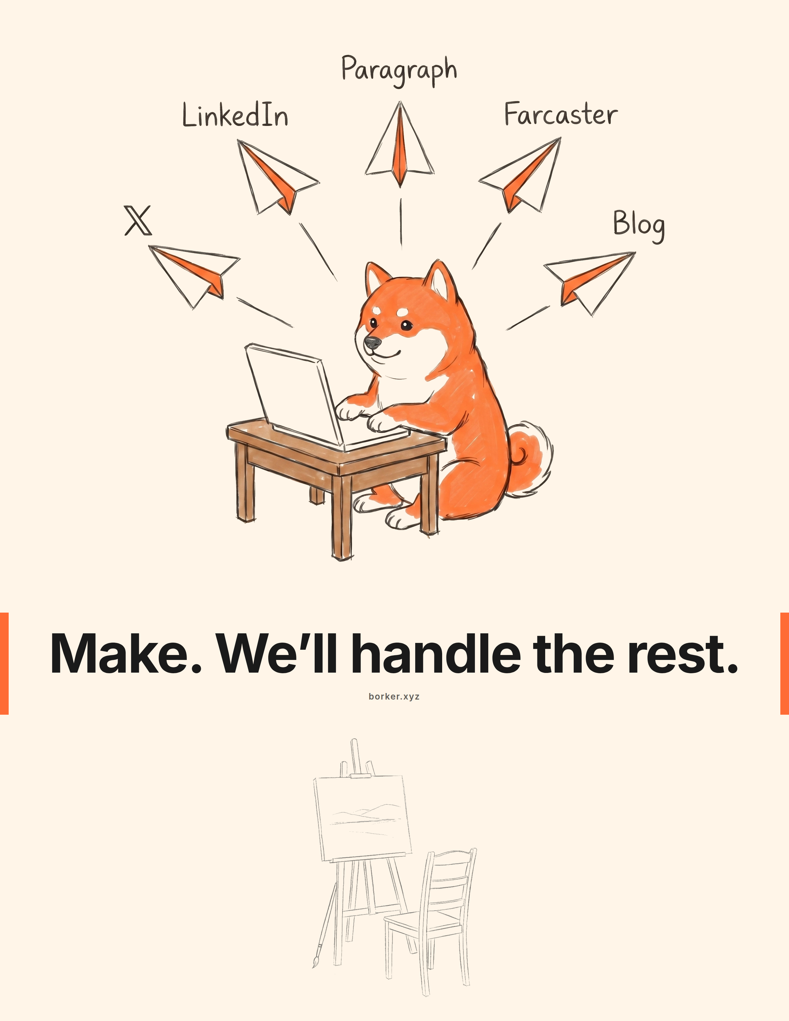
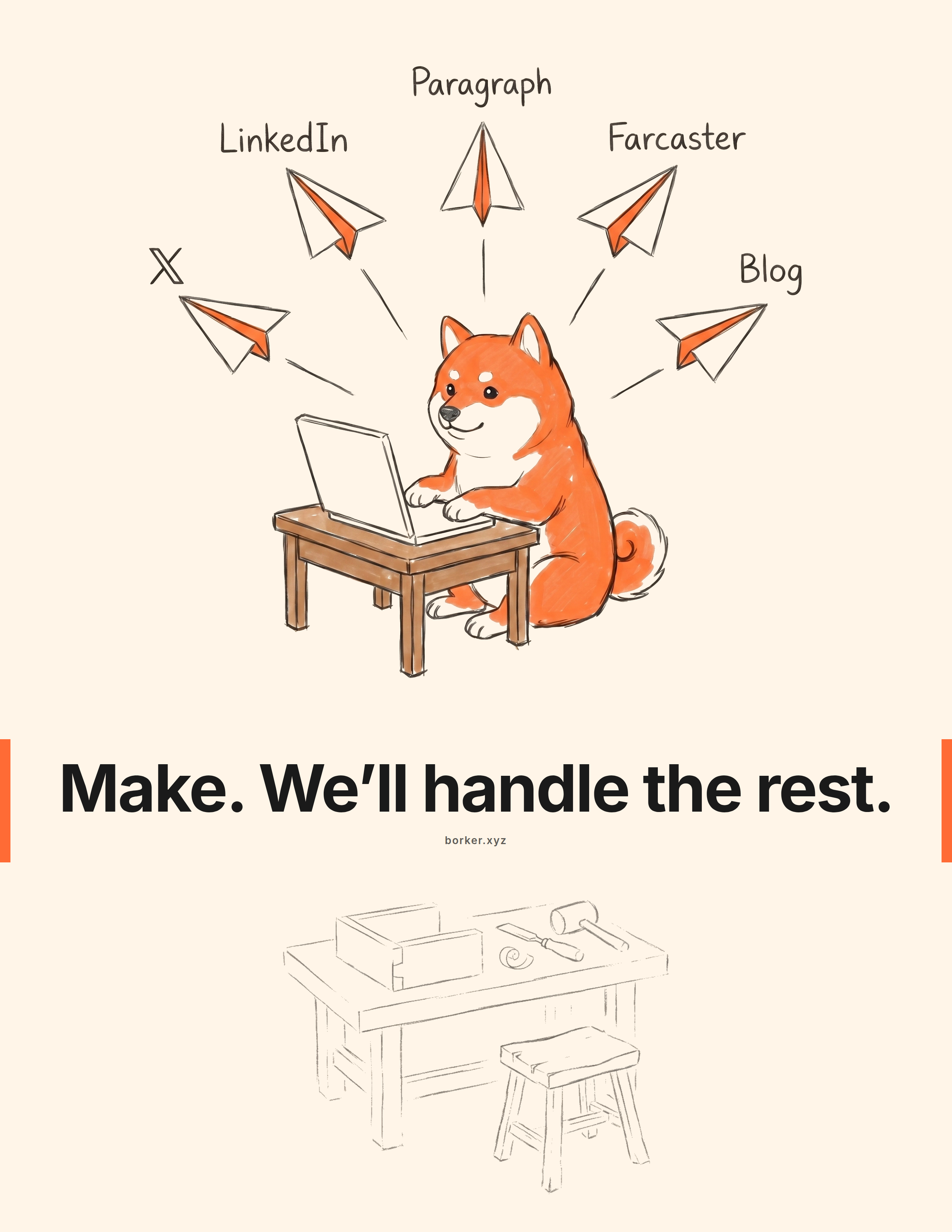

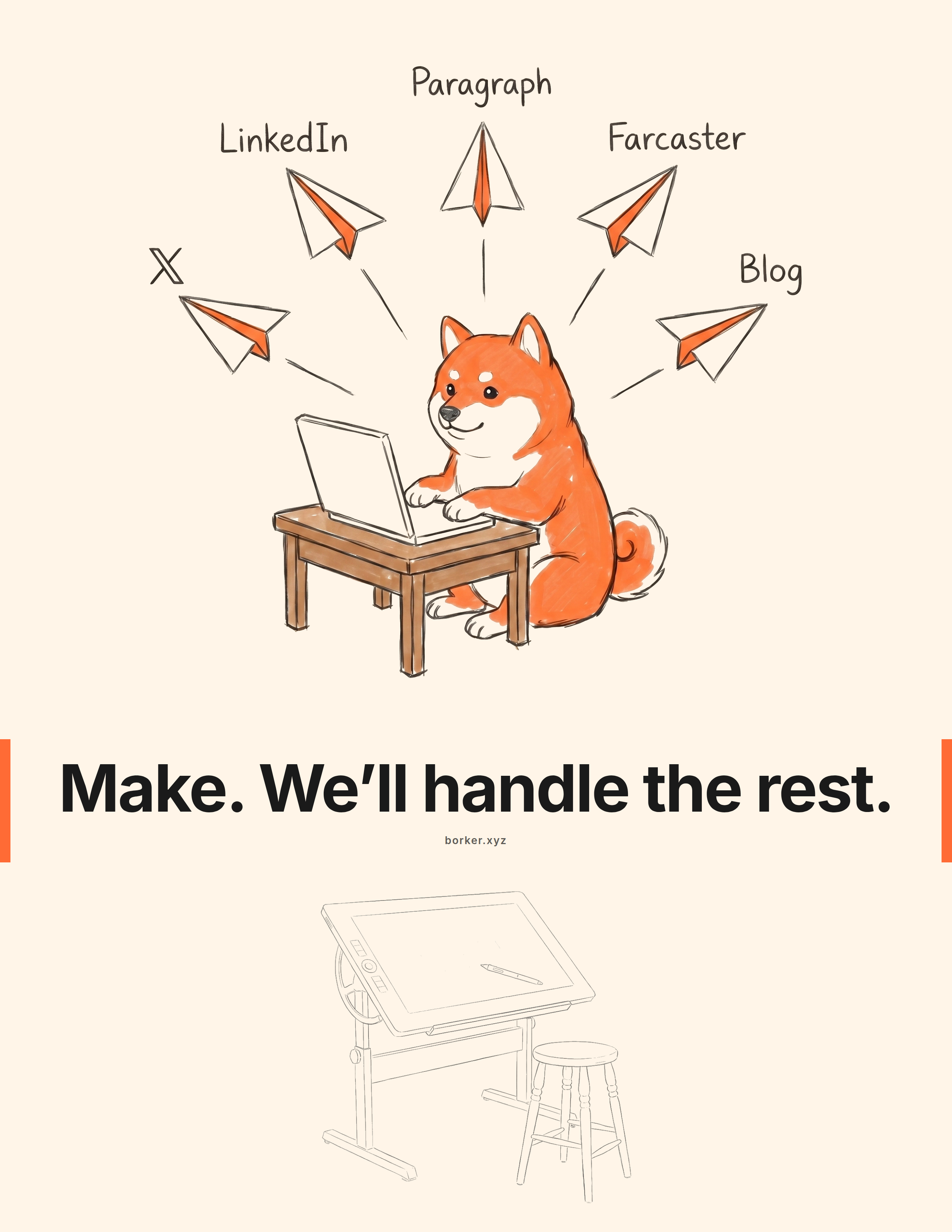
The bundle's ads/print/ folder has all four variants as 2550×3300 PNGs (letter portrait at 300 DPI, print-ready). Swap the headline, creator scene, border treatment, or footer by editing internal-docs/v2/MEDIA_KIT_AD_TEMPLATE.html and re-rendering via bun run scripts/render-media-kit-ads.ts.
Sizes:
| Use case | Ratio | Resolution |
|---|---|---|
| Letter portrait (US print) | 8.5 × 11 in | 2550×3300 |
| A4 portrait | 210 × 297 mm | 2480×3508 |
Both grammars can carry the same headline. The "Make. We'll handle the rest." line ships in both ads/social/ and ads/print/ so an affiliate can run a coordinated print + digital push without redrawing anything.
Boilerplate copy
Paste-ready. Pick the length your channel needs.
One-liner (~15 words):
Borker is the AI content engine that writes posts in your actual voice. Approve, schedule, publish.
Short paragraph (~50 words):
Borker is an AI content engine that learns a brand's voice and keeps a founder's social presence alive across X, LinkedIn, Farcaster, and Paragraph. It writes the posts, the human approves them, Borker publishes. Not another scheduler; the post itself, generated in your voice.
Long paragraph (~100 words):
Borker is the AI content engine that keeps founders consistent on social without consuming their week. It reads a brand's website and sample posts during onboarding to build a voice profile, then generates drafts across five sources: a daily topic calendar, RSS-reactive posts from feeds the user chose, auto-redistribution from their own blog (Paragraph), on-demand prompts, and multi-phase campaigns for launches. Every draft lands in a Review pipeline; nothing posts without human approval. Available on four plans, BYOK ($9/mo) through Lifetime ($149 once). Bootstrapped, built by Jephthah Mbah and Sven.
Founder bios:
- Jephthah Mbah, co-founder and program lead at Borker. Based in Abuja, Nigeria. Runs the affiliate program and partner relationships.
- Sven, co-founder at Borker. Engineer and product lead.
Press contact: sven@borker.xyz
Usage terms
You can use the assets in this kit for:
- Promotional content on your own channels (organic or paid) about Borker as a Borker affiliate.
- Press articles, podcasts, newsletters, or reviews covering Borker.
- Internal presentations or partnership decks where Borker is one of the topics.
You cannot:
- Modify the logo or remix the mascot outside the canonical poses.
- Use the assets in a way that implies Borker has endorsed your other products or services.
- Use the assets in content that competes with Borker or promotes a competing AI content tool.
- Resell, license, or redistribute the bundle.
When in doubt, ask. We respond quickly and we'd rather say yes once than chase a misunderstanding later.
Need something that's not here?
The kit will grow. If you need a pose, screenshot, ratio, or copy block that isn't in the bundle, mention it in the affiliate Telegram or email sven@borker.xyz. The most common requests get added to the next bundle revision.
Next
- Talking points to pair with these assets: Messaging guide.
- Affiliate program details: Affiliate Program.
Messaging guide
How to talk about Borker so it lands. About the product, positioning, audience-by-audience angles, channel-specific approaches, objection handling, and what not to claim.
Affiliate Program
Earn commission for sending your network to Borker. The full v1 program, with commissions, payouts, rules, and how to join.